I am text block. Click edit button to change this text. Lorem ipsum dolor sit amet, consectetur adipiscing elit. Ut elit tellus, luctus nec ullamcorper mattis, pulvinar dapibus leo.
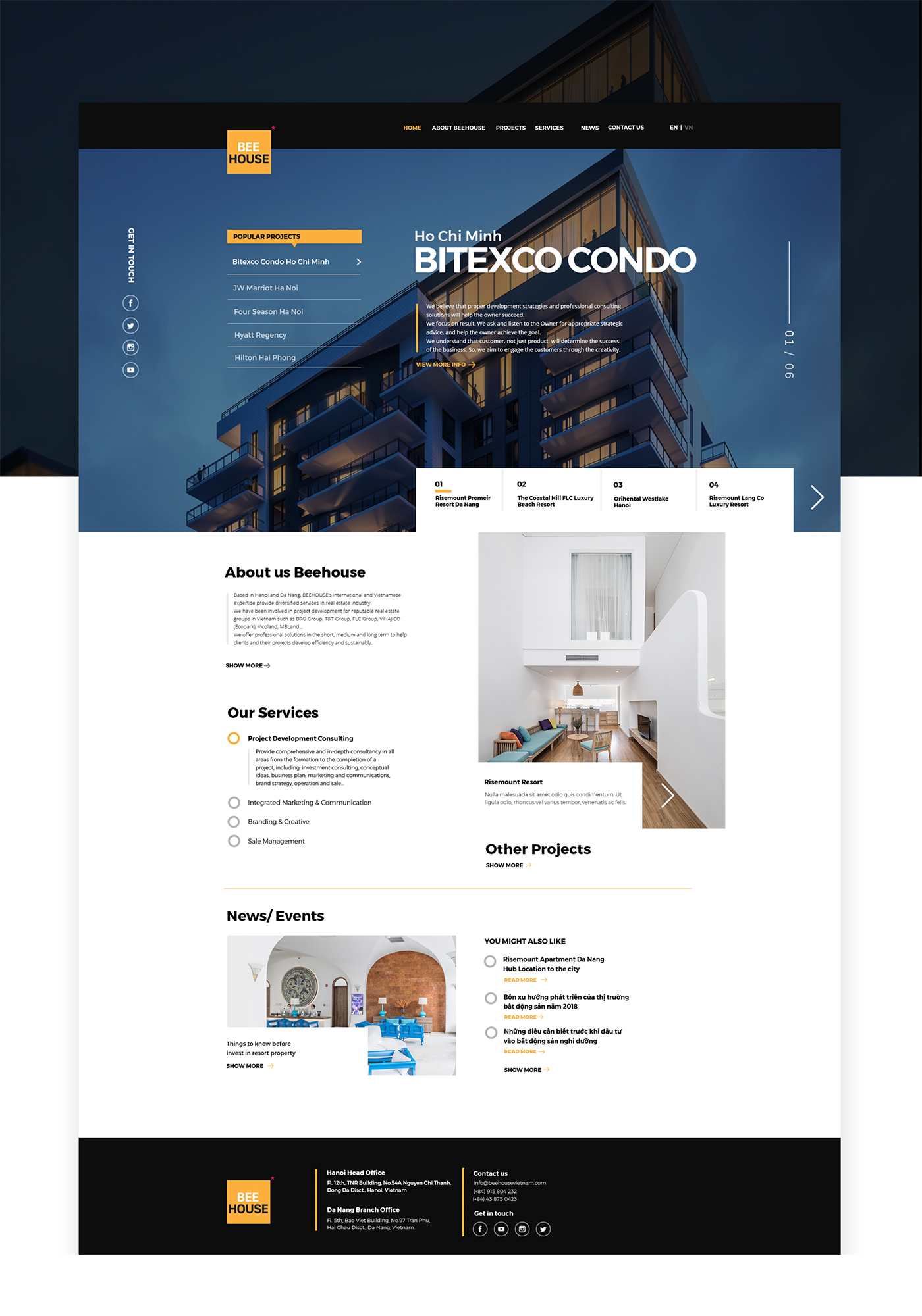
Beehouse Website
What we did
Industry
Government
Description
Inspiration
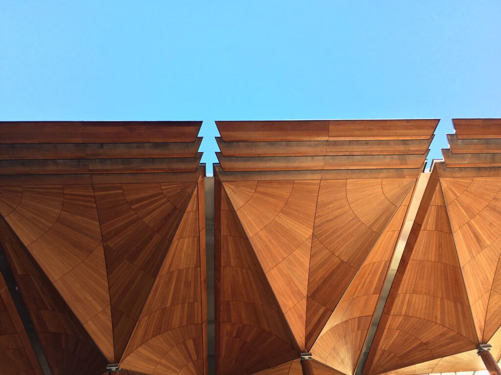
The design draws heavily from the architectural landscape of Auckland. Key influences include the geometric ceiling forms of the Auckland Art Gallery, surrounding urban structures, and the iconic pillars of the Auckland War Memorial Museum, which informed the vertical rhythm of the letterforms. The typeface name, Toi o Tāmaki, translates from Te Reo Māori as “The Art of Auckland”, grounding the project in local language and identity.
Process
The project explored how typography could go beyond communication to embody a sense of place. Using public imagery and bold layouts, the Tamaki font was tested in various poster compositions designed for public display. The visual system combined clarity, cultural resonance, and architectural influence, aiming to create a recognisable identity for the precinct.
Outcome
The final posters showcase the Tamaki typeface as both a branding element and a visual landmark. The project reflects how design can bridge culture, architecture, and community, giving the Auckland Art Precinct a voice that is both contemporary and uniquely tied to its environment.


Explore More
Explore More
Explore More
Explore More
Cohesive Construction
Cohesive Construction
Toi O Tāmaki
Toi O Tāmaki
Explore More Work
Hello world!